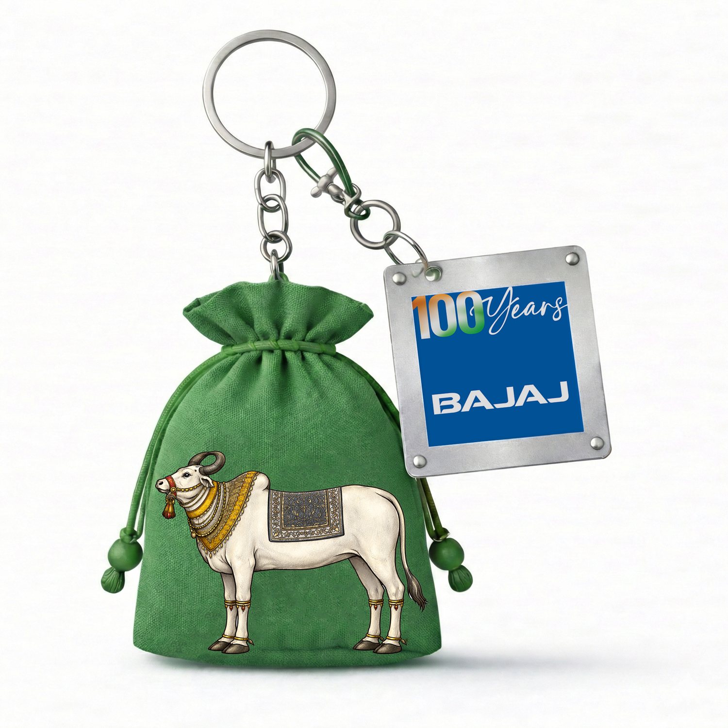
Freedom to Progress was the Bajaj Archive's centenary exhibition — an immersive journey through time, staged at the Kamalnayan Bajaj Art Gallery at Nariman Point from 11 August to 4 October. My work sat across the whole visitor experience: the BAJAJ BEYOND Legacy identity lockup, the exhibition invitation, and a merchandise line drawn from a single handwoven potli — its pattern illustrated, then carried onto a bookmark, a steel tag, a keychain, a pouch, a notebook and a serving tray.
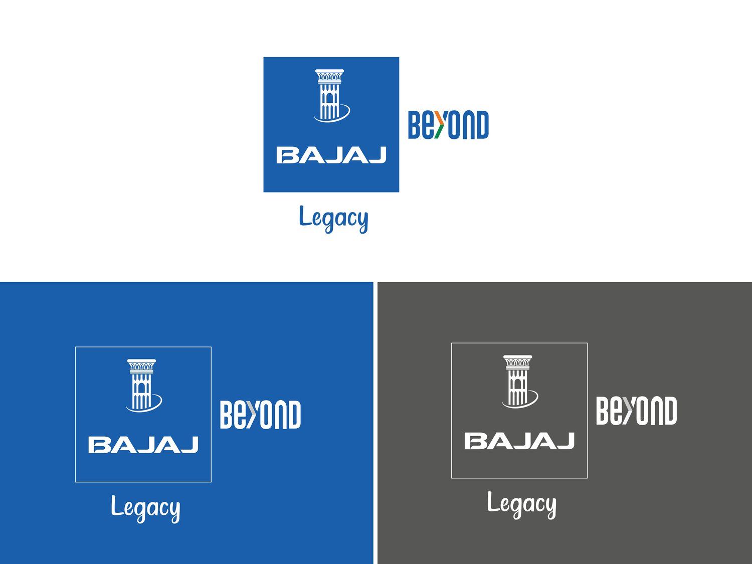
The exhibition needed a mark that could sit beside the Bajaj house logo without competing with it. The answer was a lockup, not a new logo: the blue Bajaj block, the BEYOND wordmark with its lifted "Y", and Legacy set underneath in a handwritten script — the one soft, human element in an otherwise rigid corporate system. It was built out in a positive, a reversed and a mono version so it could survive gallery signage, print and a steel tag equally well.
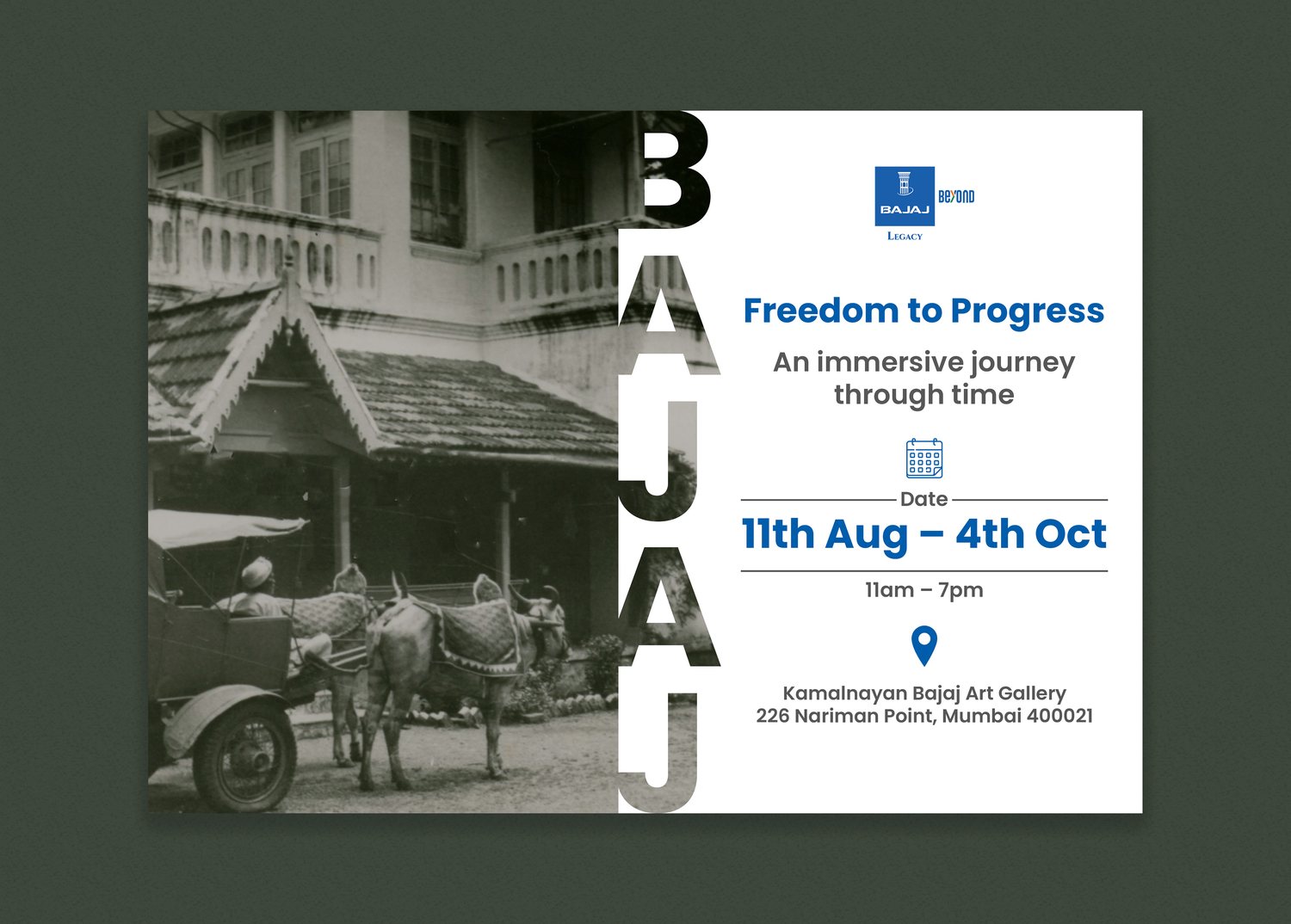
The invite had to do two things at once: feel like a document from the archive, and read as a live event listing. So it splits — a sepia photograph from the archive on the left, the BAJAJ name running vertically down the seam like a spine label, and the dates, hours and address stacked cleanly on the right. Nothing decorative was added. The archive itself was the artwork.
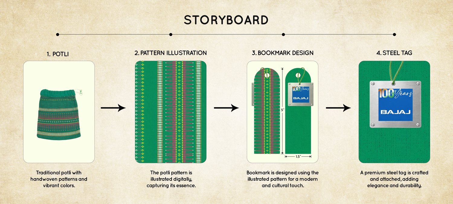
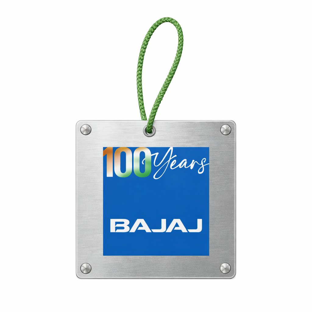
The merchandise didn't start from a moodboard — it started from a traditional potli with handwoven stripes. The pattern was illustrated digitally to capture its essence rather than copy it, then set into a bookmark, and finished with a premium steel tag for weight and durability. That four-step chain became the spine of the whole object range: every piece that followed carries the same green and the same woven rhythm.


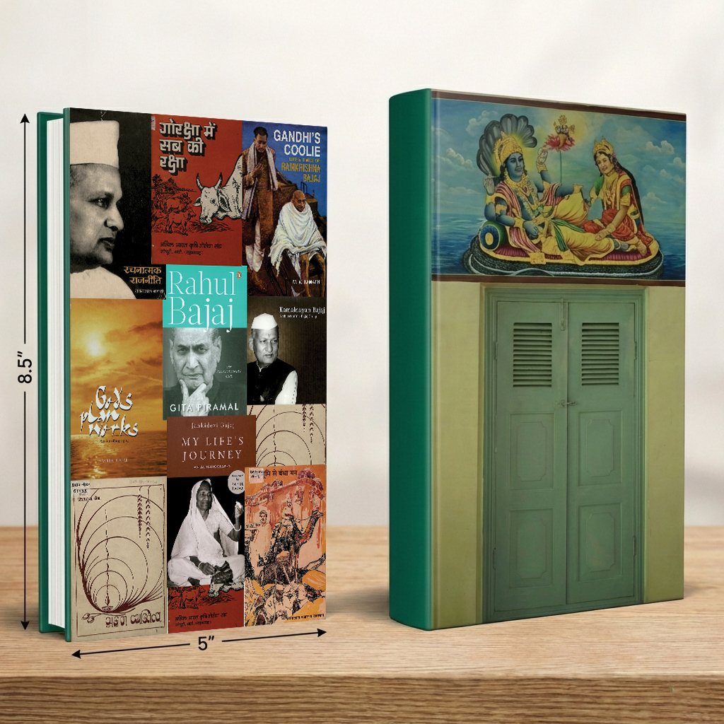
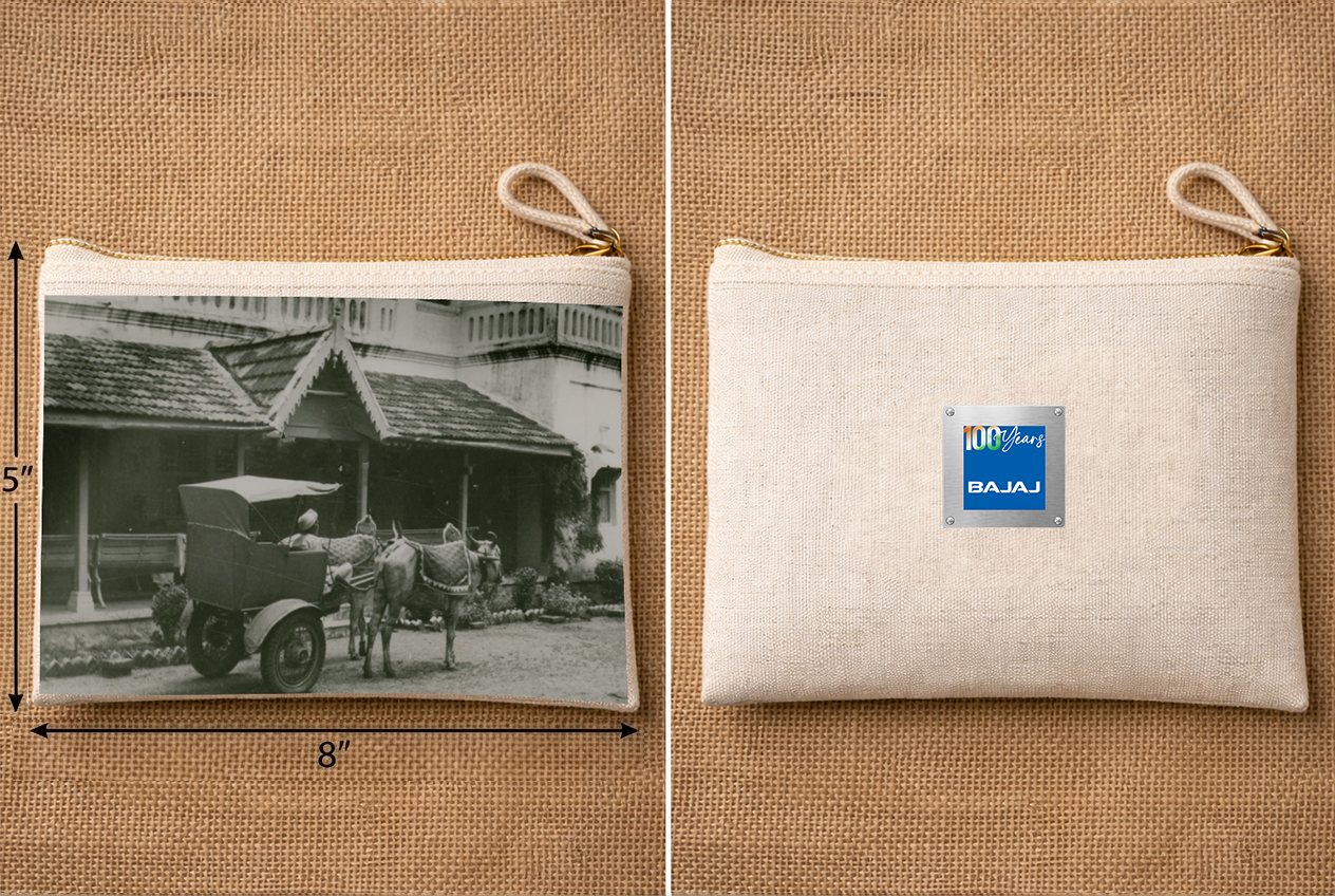
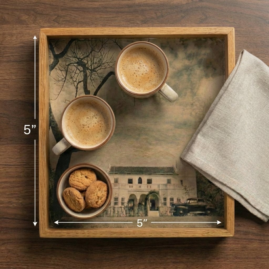
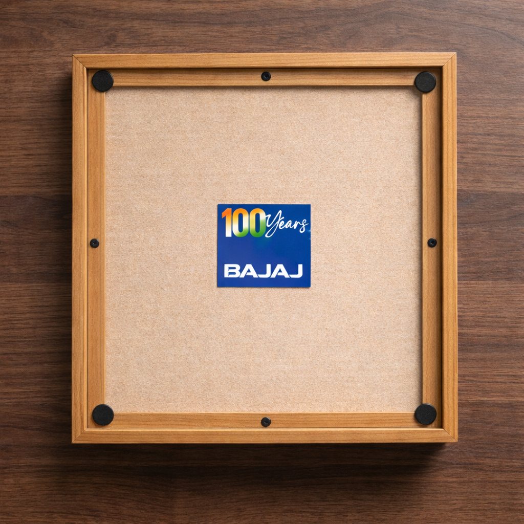
The rest of the range put the archive into everyday objects. The notebook is the clearest example: the front is a collage of the family's own book jackets — Gandhi's Coolie, My Life's Journey, the Hindi and Marathi editions — while the back reproduces the green shuttered door of the Bajaj house with its painted panel above. The pouch carries an archive photograph on one face and the mark on the other. The serving tray is designed on both sides: a sepia streetscape under glass at 5×5 inches, and the centenary mark on the cork reverse.


Sit the exhibition mark beside the Bajaj house logo instead of inventing a rival to it.
Sepia photographs and real book jackets carry the design — no added ornament.
A handwoven potli, illustrated rather than scanned, becomes the pattern for the whole range.
Steel, braid, cork and wood — the pieces had to feel like keepsakes, not merch.